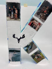
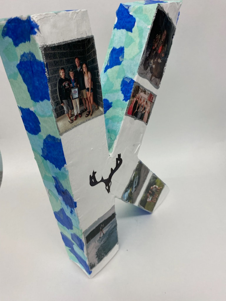
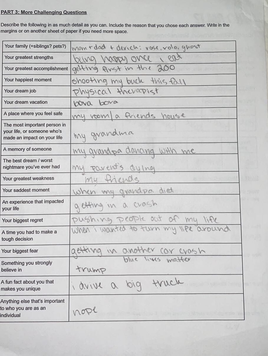
I think my best artwork is my letter K figure. I think it is the best because I think it turned out really good and it shows the person I am. If I could redo an artwork it would be my clay pot. I would redo it because I didn't take much time on it and just threw it together in one day. I learnt for my future that everything goes better if you plan it all out and that you can't just start something not knowing where your going with it. I wish we could've done some airbrush painting. I think it would be really cool to paint figures or sculptures with that. 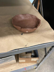
0 Comments
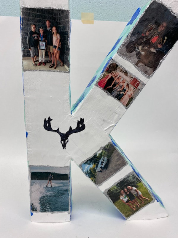
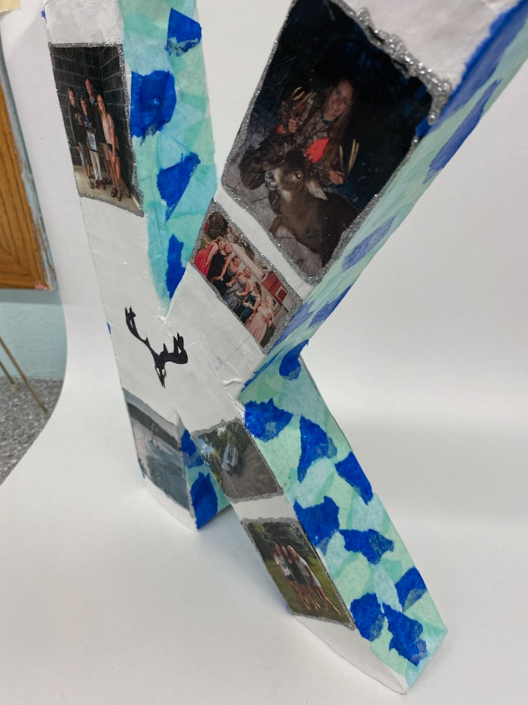
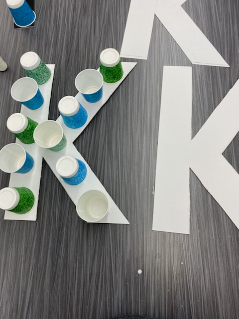
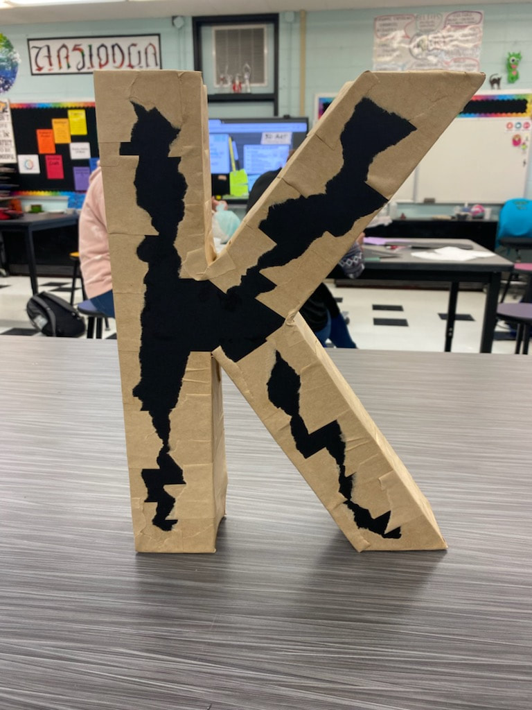
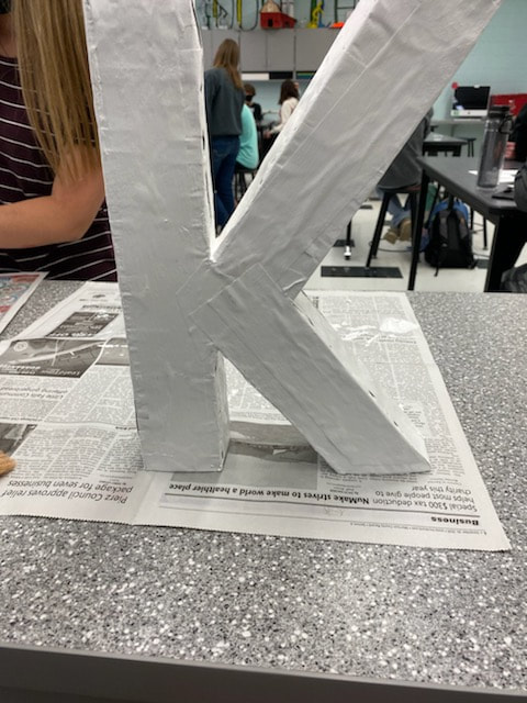
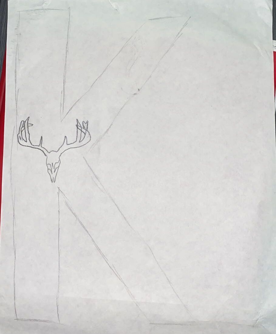
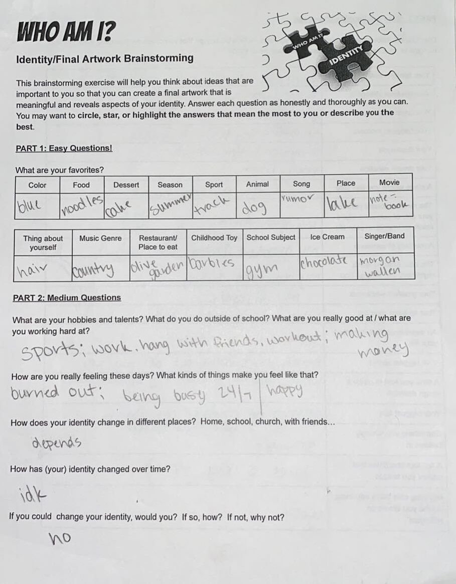
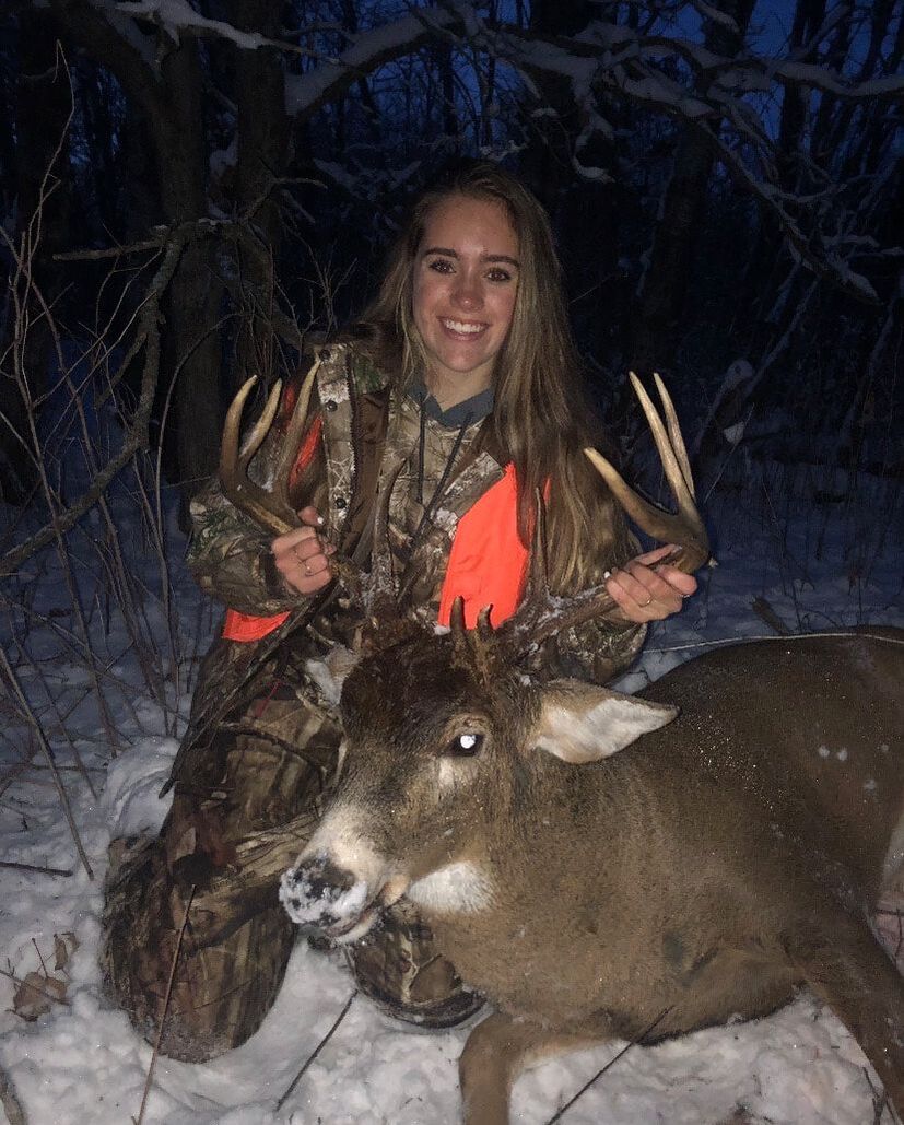
My artwork is in the letter K. I have 6 pictures around the letter of me and my friends, family, and doing things I like to do. There is glitter from a glitter pen painted around the edges of the pictures. There is a deer head/skull with antlers painted black in the middle. For the outside of the letter I tore up light, dark blue, and light green tissue paper and used modge podge to stick it to the outside. The base of the letter is white. I started out by making a K on a thin, regular piece of paper. I traced it onto a very thick type of paper/cardboard. I made two of them, then glued a bunch of dixie cups in between the K's. Once those dried I glued the cardboard tape to the both sides of the K to help hold them together and to make it all one piece. Once I finished doing that and everything dried, I painted gesso onto the letter. It was really thick and hard to make it even. It made some of the tape peel up. After the gesso was dried I painted white paint onto it because there was some weird marks on it that I didn't like. The thing that I'm trying to show in my artwork is who I am. What things make me the person I am and what makes me happy. My hunting pictures are something I've done/wanted to do since I was a really girl because my dad did it. My truck is my whole world and I've rode in that truck my whole life. When I was 5 or 6 I told my dad I wanted to drive a big jacked up truck just like him and I've wanted that ever since. I have a couple pictures of my friends and family on there. I don't know what I'd do without my friends by my side every step of the way. Then, the last picture on there is one of me water skiing. We just bought some land on Sullivan lake and I spent all my free time over there last summer and now I will be there whenever I can this summer. My goals for this artwork was to create something that showed the type of person I am. I think the the colors I used and the pictures I picked showed some of the things I like to do and the things that are most important to me. I think my artwork turned out pretty good. I added more things than what I planned on having on it. I ended up adding the glitter and the tissue paper. I felt that there needed to be more in my art, so I added my favorite colors and something to make the pictures stand out a little bit more.
I am going to be showing the things and people that make me who I am. I will have pictures of hunting, friends, family, hobbies, and sports I like to do. My plan has stayed the same from when I started, but I think I'll have to print out a lot more pictures because I don't know how I am going to cover that whole space. I really like how the letter turned out. It is very sturdy, and has a good shape. The only part that I am still working on is putting the pictures on, drawing the deer skull, and adding some color with tissue paper. I started to learn about art history and how the Native Americans used art to show who they are and what they feeling. I am learning to create works that show how I'm feeling or who I am. I am starting to see that a lot of things make me the person I am.
My plan for my final artwork is to do a 3D letter. I am going to do the letter K for my name. I am going to use new tools to make this artwork. It requires some kind of board, dixie cups, gesso, and cardboard tape. I am going to try to express who I am with my artwork. I think I am going to put pictures of my friends, family, and things I like to do on my letter. Then, I'm going to put a deer skull and antlers in the middle of the K and paint it black. I might put blue and green tissue paper in different spots of the letter because they are my favorite colors.
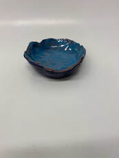
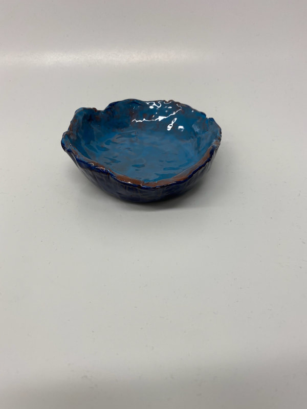
I was originally going to make a pinch pot, and turn it in to a turtle. I had a lot of struggles in the beginning to just make a bowl. I decided not to make it into a turtle, and just a regular bowl because I noticed that a lot of other peoples' artworks were breaking when they added something else to it. Something else I struggled with was that I didn't put cling wrap inside of the paper bowl I used to shape mine, and since the clay was wet, it peeled the paper off the bowl and stuck to the clay. In the end, I made and bowl and decided to paint it with two different shades of blue. The lighter blue on the inside was called, Blue Yonder. The dark blue that's on the outside is, Mosaic Blue. I learned to embrace my mistakes like the little holes and scratches in my artwork, by making them the thing that gives my art texture. I learned from these mistakes and will take more time on clay, making it how I want it to look.
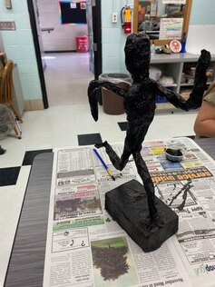
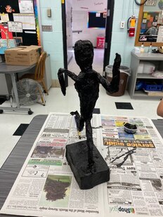
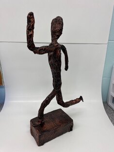
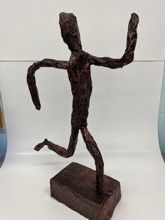
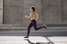
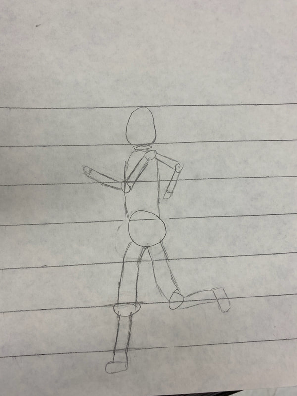
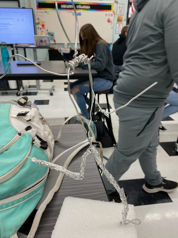
This is my final artwork for my Figure Sculpture. I wanted it to look like a runner/a person running. I like how to bronze color finished on the black paint, but I think there's a little too much of the color. I underestimated how powerful the color would show up. I started making my art by cutting out different lengths of wire and twisting them together to get something that resembled a human. Then, I started to wrap tin foil around the wire and add dimension and width in the torso and head. I also added a styrofoam block on the bottom layered in the same stuff on the figure. Once I was done with that I layered it in paper towels held on by modge podge. Then, I painted it all black and put the bronze paint on. I really wanted to express and show how much I care about running. Running has been a huge part of my life for as long as I can remember. It has always been something really important to me, something I always pushed myself to be better at. My goals for this artwork was to make something that actually looks like the picture I found online and the one I made in my head. I really like how my art turned out. It looks so much better than what I expected it to look like. I only had a couple problems. For one, it was really hard to balance the figure correctly on one leg. It kept slowly falling sideways, but I was eventually able to figure it all out. Another problem was the when I first put the bronze paint/sparkles on it was really powerful and I didn't know how to fix it, so I just left it be.
The first picture is what I want my artwork to look like. I first made what I wanted my figure to relatively look like. The wire part I stuck into a styrofoam block right now and has tin foil over it. I have tin foil all wrapped around it, and now I am putting strips of paper towels using modge podge to made them stay so I can eventually paint it. I'm trying to express my love for track and sports by making a person running.
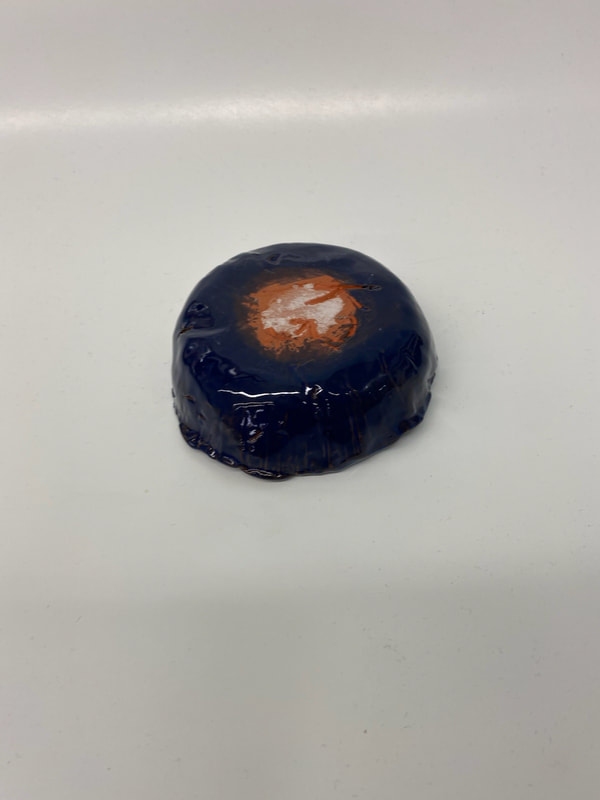
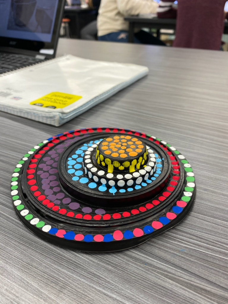
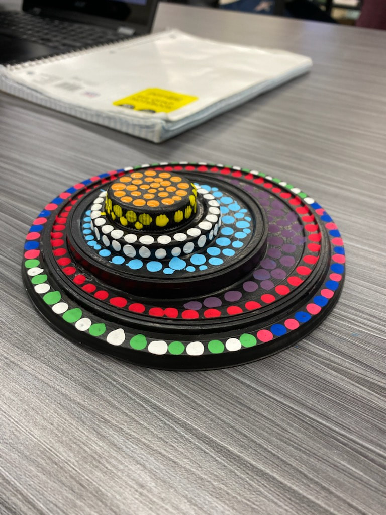
This is my dot dimension artwork. I glued five different types of lids/covers on top of eachother. Four of them were made out of plastic and the other was a type of medal. Then I used a Q-tip to put on the dots of paint. The colors are dark blue, light blue, red, pink, dark purple, orange, yellow, green, and white. My goals for this artwork was to make something that I've never made before and to go out of my comfort zone. I think that my artwork turned out pretty good. I was expecting less of the black paint showing, but I like the overall look of it.
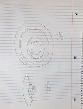
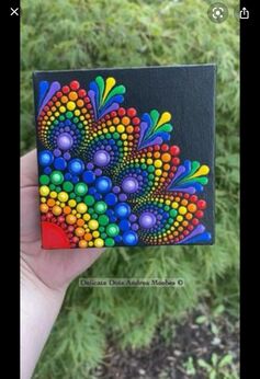
This is my sketch for my project and one of the inspirations. I am focusing on using found objects and paint to make a dot dimension artwork. I am learning to use tools and different materials when making artworks. I am using different types of covers, paint, and glue to make my artwork. I am planning on using pattern and movement.
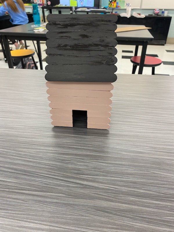
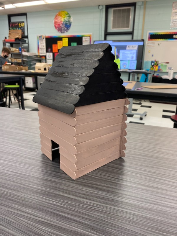
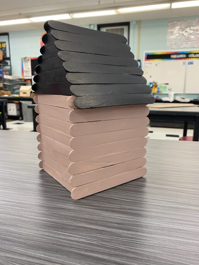
This is my "log" cabin. I made it out of popsicle sticks and used hot glue and wood glue to put it together. In the beginning I tried to envision what this was going to look like and it is mostly what I wanted to be. I think that the roof was a little bit taller than what I wanted it to be, but I am still happy with how it worked out. Some problems i had was the color of the paint. I really struggled to make it the color that I wanted it to be, but I embraced the problem and painted the house. Even though it wasn't the exact color I knew that it was close to what I wanted it to be. Another problem was that the wood glue took longer than what I thought it would take to set and I knew if I used hot glue when putting the sticks together I wouldn't have the time I wanted to fix and move them around.
|
AuthorI'm a sophomore. I like sports and noodles. Archives
June 2021
Categories |

 RSS Feed
